Interesting Projects
E. 88th St. Cityscape – Non-Repeating Kids’ Room Wallcovering Design
Sometimes, a client has a general concept for a wall decor design but they trust the artists at HD Walls to take that concept and turn it into something truly extraordinary. One such project came from a client looking to decorate the walls of a kids’ room in an apartment complex. It’s always fun to decorate for kids, but this is a unique story.
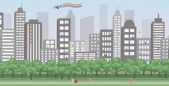
The basic concept given to our design team, was that the wall decor was to include the elements of a large city, but with whimsical characters and animals as its occupants. The HD Walls designer who took the lead on this project, Casey Jacobs, got right to work sketching and scribbling and molding a plan to bring all of the requirements together into a cohesive, attractive design.
Since the design was catered to kids, the designer ultimately decided that an ultra-realistic, architectural masterpiece of a city was not the kind of thing a child looks for or even thinks about. Walking a fine line between cartoonish and realistic, Jacobs worked with Champalimaud Design to find the perfect blend.

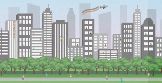
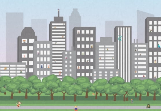
Along the way, the designer decided that no part of the cityscape should repeat, and that every inch would be unique. She painstakingly created the animal-like characters on the street, behind the trees and even in the windows.
Zoomed in:

A child could look at the wallcovering all day, every day, and likely never find everything so skillfully incorporated into the “city.” Who knew wall decor could be such an entertaining, educational part of a child’s space? One could spend all day looking at all of the tiny characters and features included.

Zoomed in:

So much detail was added to the artwork that, even when zoomed in, you can see the perfect lines, curves and colors in every inch of the design. This is important to the overall execution; as a child can stand inches away from the wall and the details remain sharp.
The example below may best illustrate the extreme attention to detail. From afar, you can see what could be a snake crawling down the side of a building, but up close, it has dimension and its head even glimmers in the “sunlight.”

Zoomed in:

The client wanted a smooth base material, but with a textured appearance. How is that done? In this case, the sustainable Terralon base media was used, and a texture was digitally overlaid throughout the entire piece. So it’s smooth to the touch, durable, sustainable, but it has the appearance of a subtle texture. Problem solved. Now, find the fox in this “zoomed out” picture:

Here he is! (Zoomed in:)

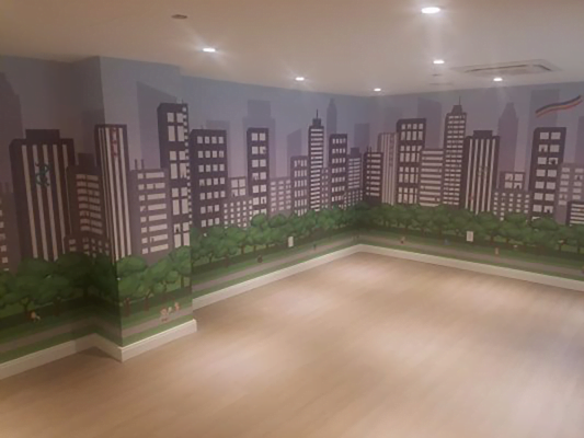
HD Walls worked with Danielle Jager of Champalimaud Design on this project, who kindly provided images of the final wallcovering installation, truly demonstrating the scope of this unique, non-repeating work of art.
Install shot:

From concept to creation, HD Walls can and will complete the seemingly impossible time and time again. We know how hard it can be to see what a wall needs with the mind’s eye, but our designers have powerful insight and somehow pull it all together. They match or choose the colors, they decide which of our exclusive materials will complement the design and surrounding decor in the most effective way, and they work with clients from start to finish so everyone stays on the same page.
If you have an idea, or part of an idea, and if it seems impossible, contact HD Walls before you give up on it. The team just might have a solution and your imagination can become a reality.

